Responsive design is now a common part of every modern website. I will now show you a simple trick on how to set up the gallery player widget to be responsive and adapt to the design of your mobile websites.
The basis of the widget is a container element with the style definition of size. Defaults are set to a fixed height and width is set to 100%. Look at the following HTML code of the gallery player widget. The attribute style contains CSS that defines the size of the container.
<div class="pa-carousel-widget"
  style="width: 100%; height: 480px; display: none;"
  data-link="https://photos.app.goo.gl/CSV7NDstShTUwUZq5"
  data-title="Mr. Monstro">
    <img data-src="https://...image1.jpg" />
    <img data-src="https://...image2.jpg" />
    <img data-src="https://...image3.jpg" />
</div>
Note: Display: none hides the container until it is decorated.
It is also important for you to know that the size of the widget adapts to the container. When the size of the browser workspace changes, the size of the container also changes. This is ensured by the window.onresize event.
How to setup a container for responsive design?
I will show you this best with the following examples:
1) Fullscreen view.
In this case, I set the size of the container to: width: 100vw; height: 100vh; display: none;
I.e. the width will be the same as the width of the work surface and the height as the height of the work surface. To achieve this badly, use the units vw and vh.
Example 1: responsive-gallery-fullscreen-view.html
2) The size of the gallery is the same as the size of the browser area.
This is practically the same setting as in the previous case, but any content, such as headline, etc. is inserted before and after the widget. The height of the widgets is still the same as the height of the browser desktop.
Example 2: responsive-gallery-100vh-view.html
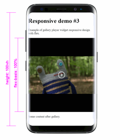
3) Using flex formatting
In the latter case, I used a layout formatted with flex (vertical view only).

Example 3: responsive-gallery-flex-view.html
The page is not scrollable and the content must fit on it. The widget now populates the contents of the element <div class="gallery"></div>. The container fills the entire parent element. In this example, the container style is set to width: 100%; height: 100%; display: none;